
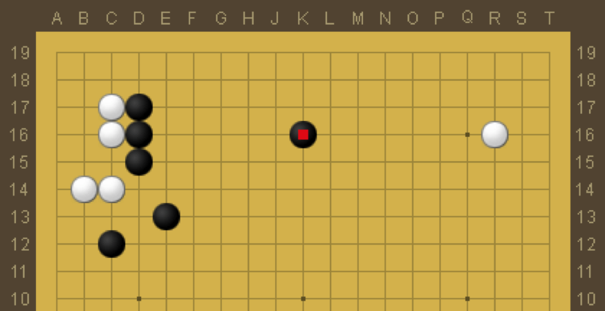
One thing that Go players learn quickly is a visceral, aesthetic appreciation for an efficient allocation of resources.
Even a beginner would recognize the black stones in the first diagram as beautifully placed. It is the minimum number of stones to securely enclose the White group in the upper left.
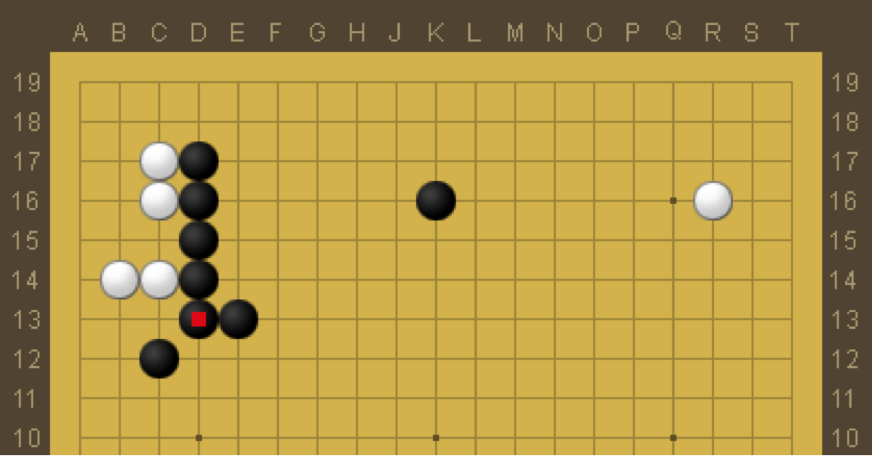
 The next diagram adds just a single stone and is immediately recognizable as ugly. Even though it is a significantly more secure shape, it is not an efficient allocation of resources.

The third diagram adds yet another stone and is an even stronger shape in practice, but it is such an inefficient allocation of stones that it would never occur in a real game.
If only it was this easy to tell if a company was allocating resources efficiently.

You must be logged in to post a comment.